SKYSCANNER
BRAND DEVELOPMENT
Skyscanner already had a strong brand in place, so we were surprised when they reached out for help with its development. They had all the tools for a great visual identity, but the rules for using these elements weren’t fully defined, making it difficult to maintain a cohesive brand experience. We collaborated with the head of brand through a series of workshops, helping to refine and build on their brand foundations while they were building their in-house creative team.
DELIVERY
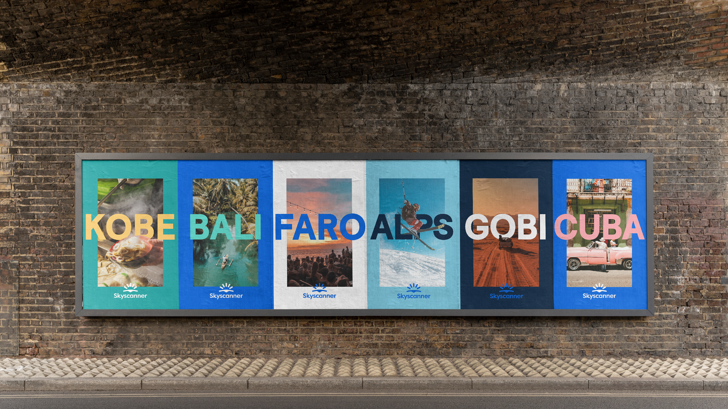
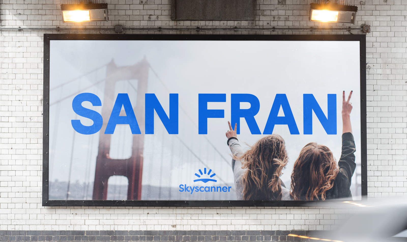
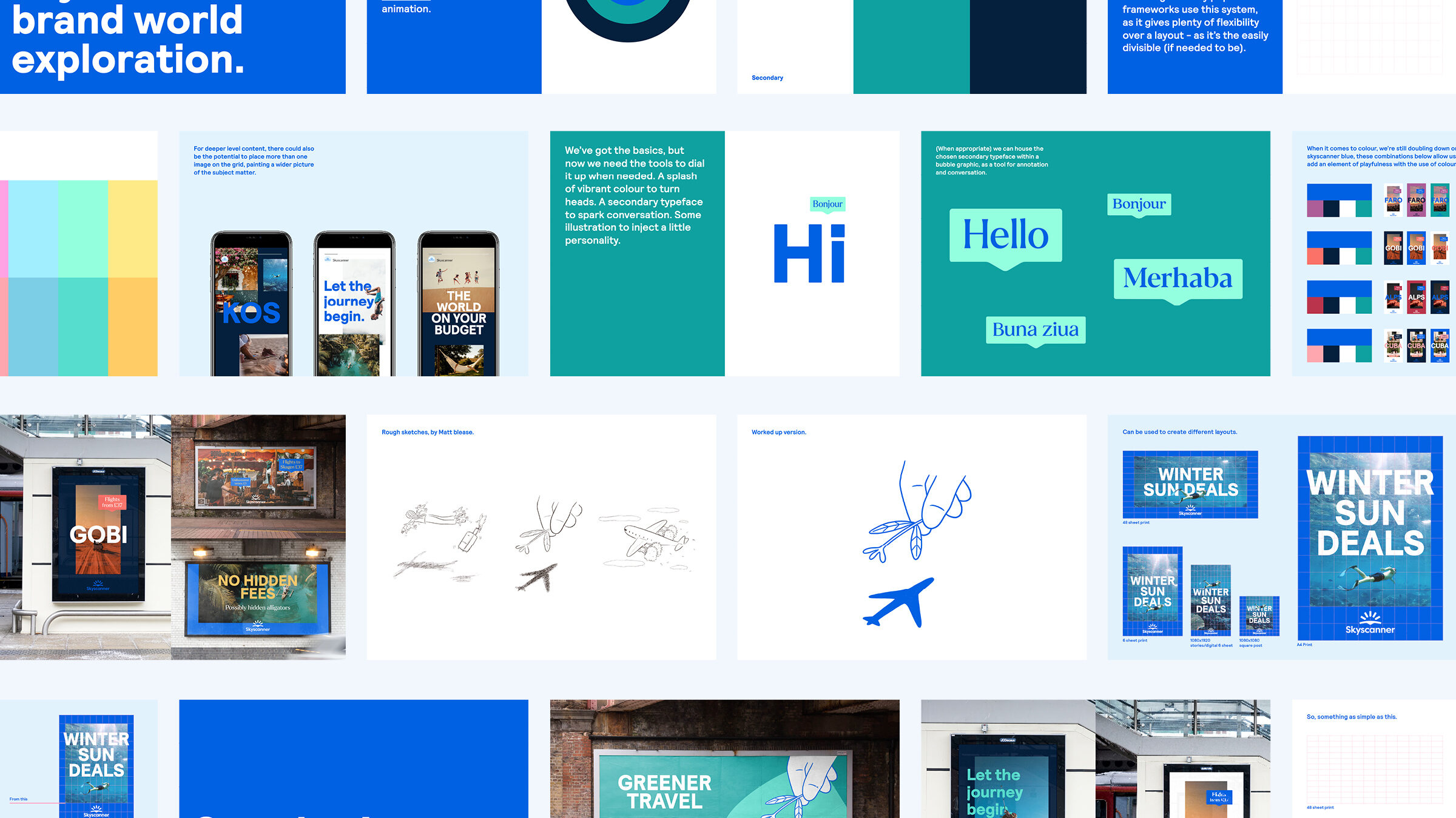
To start, we went right back to basics by creating a grid system—a foundation for the brand that didn’t previously exist. Think of it as the Skyscanner brand flight path, providing structure and direction.
Building on this, we developed a system that’s as simple and reliable as the customer experience—offering a solid framework with a stress-free process for producing consistent, more confident visual communications. It’s a system designed to grow and evolve over time as their in-house team took shape.
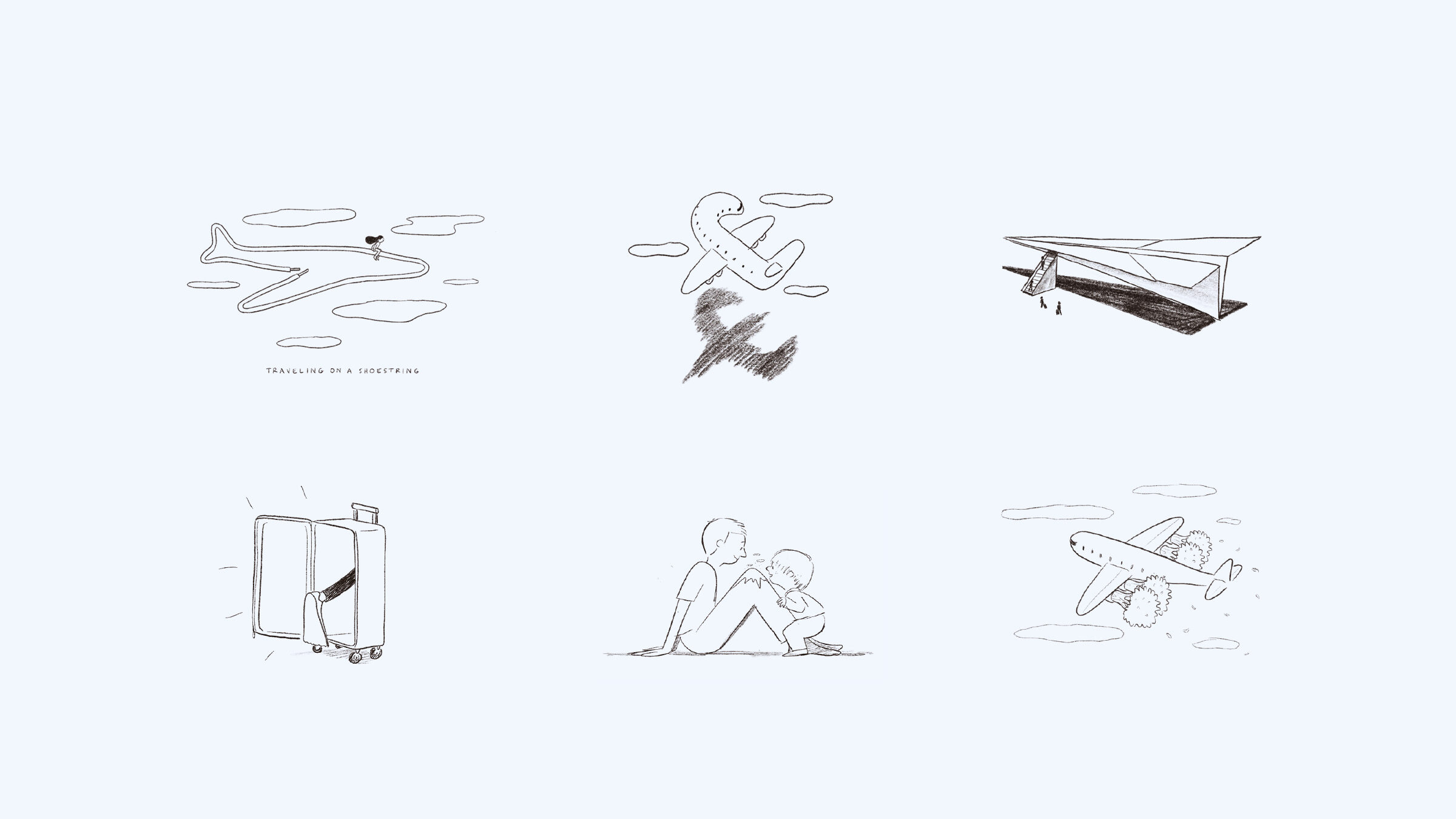
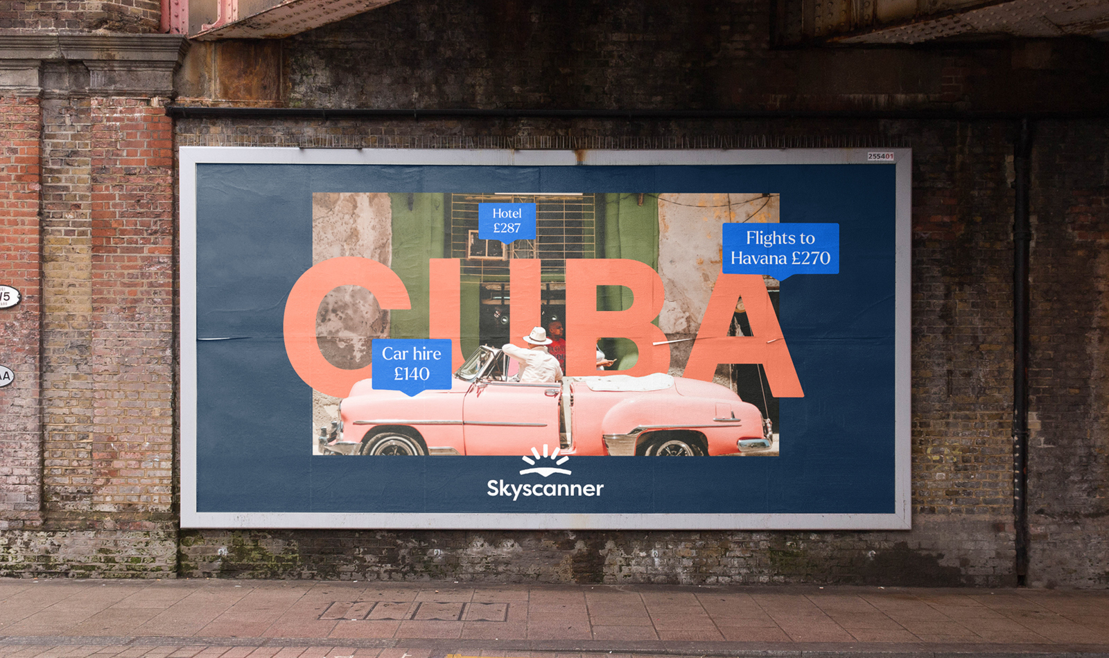
As part of the brand development, we also introduced new elements, including a serif typeface to add a playful contrast to Skyscanner’s bold, confident sans-serif. We redefined the approach to photography, moving away from generic stock imagery in favour of a more real, in-the-moment style. And to bring even more character to the brand, we explored a series of test illustrations as an additional asset, teaming up with the brilliant Matt Blease.
SERVICES
+ Brand development and guidance
+ Development workshops